The janitorial labor market is perhaps tougher than it has ever been in the last several decades. As I talk to contractors all over the country, with a few exceptions, this is the general consensus. The labor market is tough for cleaning companies. Now I don’t like to dwell on the doom and gloom, but sometimes it is good to get a reality check so we can make better decisions moving forward. So in the spirit of understanding, here are a few graphs and charts the will paint a picture for you of what is currently happening in the blue collar labor world.
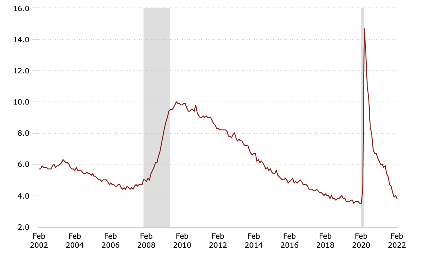
National Unemployment Rate
The chart below tracks the national unemployment from 2002 to 2022. Despite the brief COVID spike in 2020, we have been trending toward a historically low unemployment rate for some time.
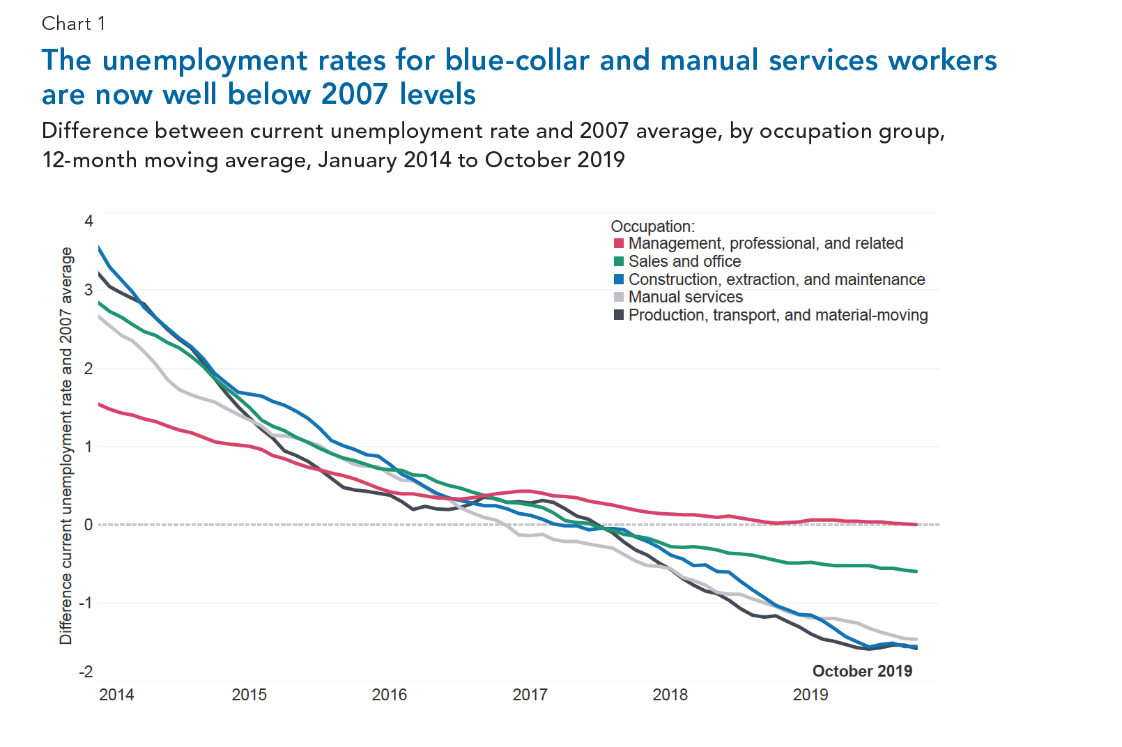
Blue Collar vs. White Collar Unemployment Rates
The unemployment chart above does not tell the whole story for janitorial contractors and others in blue collar industries. The following chart compares current unemployment rates to the previous low in 2007. However, it breaks it down into various groups. The blue, gray, and black lines represent blue collar trades. The green and pink lines represent traditionally white collar positions. You will notice that when compared to 2007 rates, blue collar unemployment is even lower than their white collar counterparts.
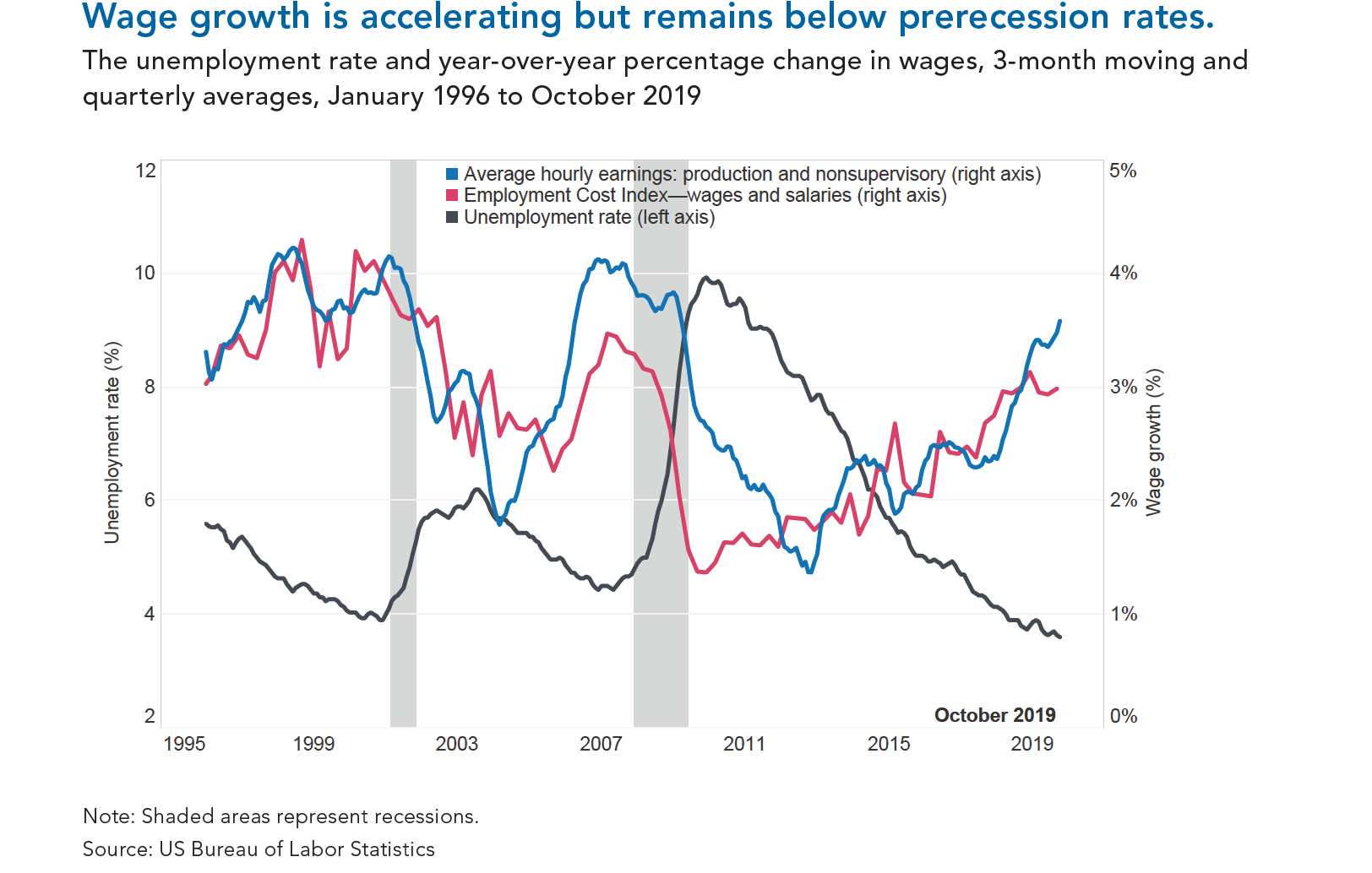
Wage Growth vs. Unemployment Rate
As you would expect, as the unemployment rate has dropped, the wage rates of employees has risen. The chart below demonstrates this inverse relationship. When the supply of labor drops, the demand for labor rises, bringing an increasing demand for wages with it. So do not be surprised if you are having to raise you wages to attract and retain labor.
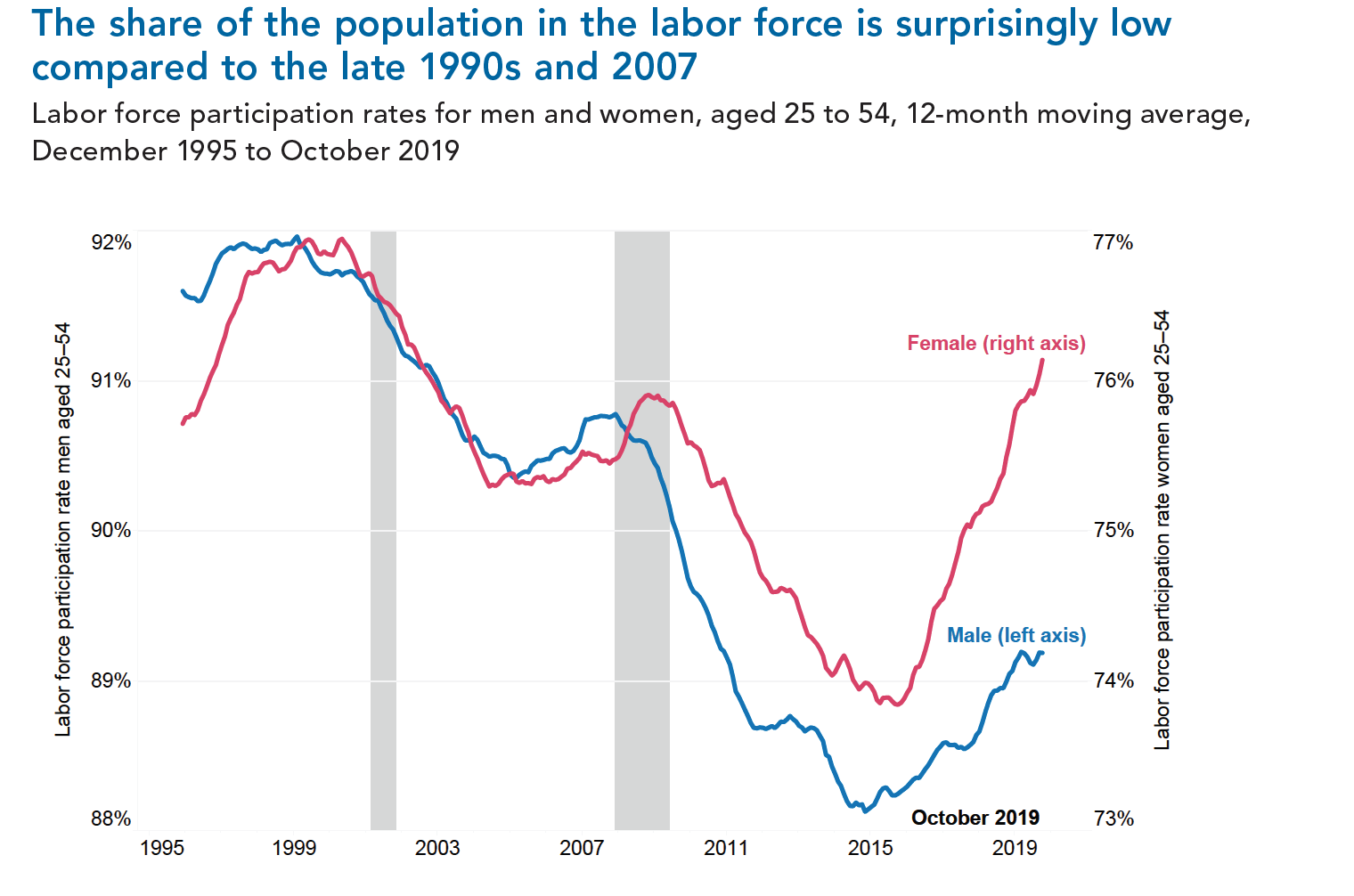
Labor Force Participation for Working Aged Men
Over the last two decades, the percentage of working aged men participating in the workplace has dropped from 92% to 89%. The three percentage points represent millions of workers in the US. The chart below documents this trend (blue line). What is not shown on the graph is that many of those men are only entering the workplace in part time positions.
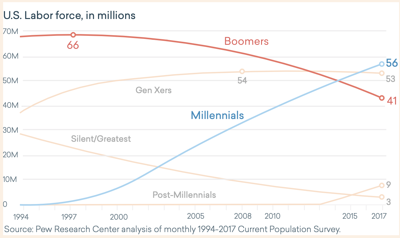
The Loss of the Baby Boomers
We all knew it would happen at some point. The baby boomers, arguably the most loyal group of workers, are finally starting to leave the workforce. And COVID has only accelerated that exodus. As you can see from the graph below, the boomers exit rate is starting to pick up and will soon accelerate. This means we need to be prepared to recruit and retain millennials and Gen Z more than ever before.
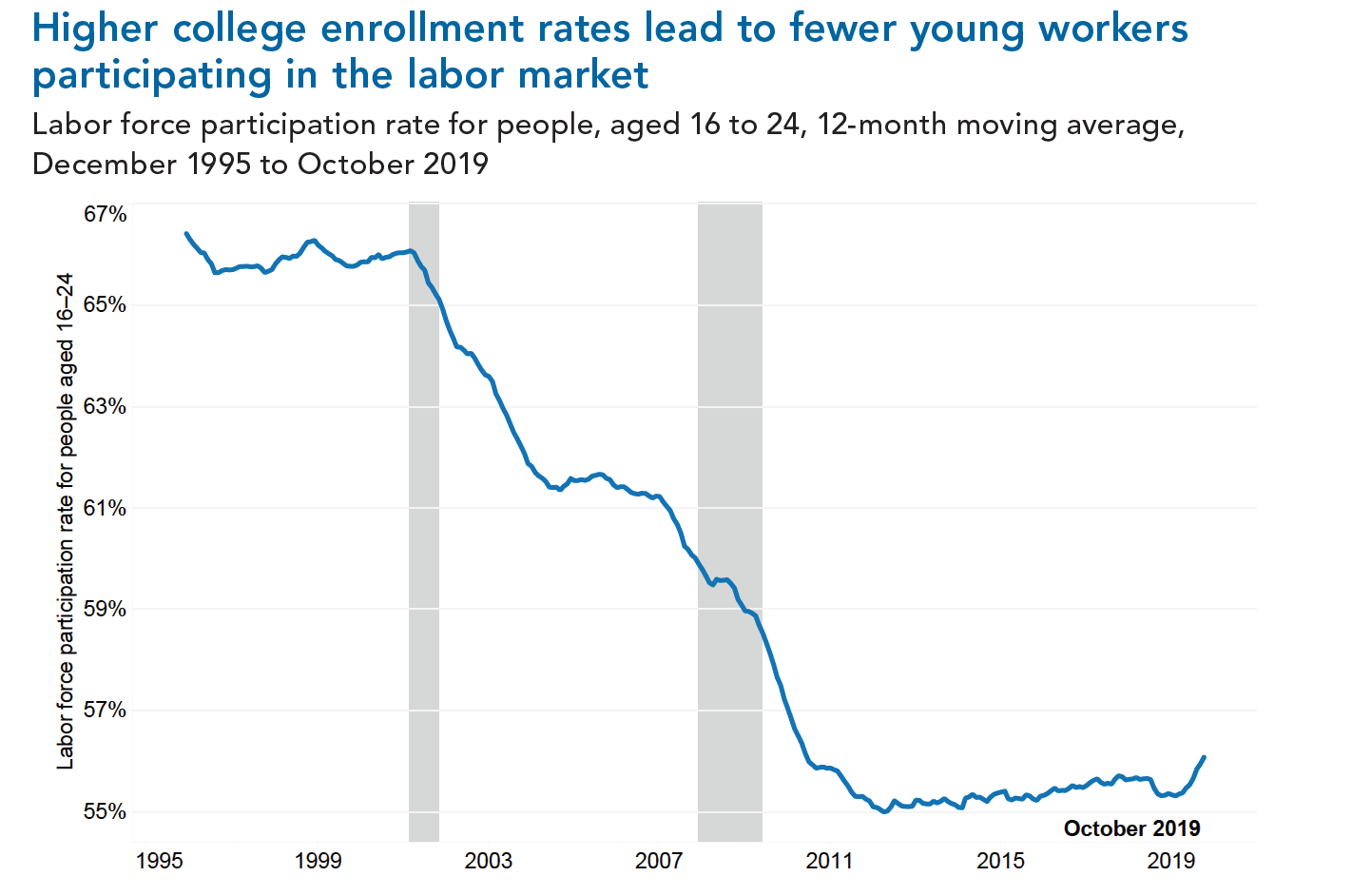
Fewer young workers participating
Starting in the late 90s, there was a significant push for young people to attend college. Some form of college has become the new high school. In the chart below, you can see the drop off in younger workers participating in the labor force. The emphasis on college is likely the largest contributing factor to this trend. However, what this does reveal is that there is an untapped labor pool to take advantage of if you can crack the code.
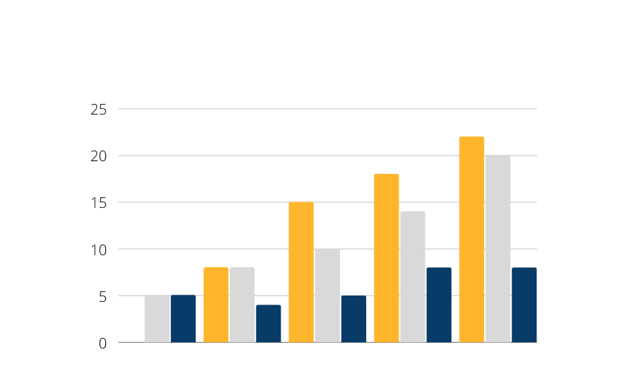
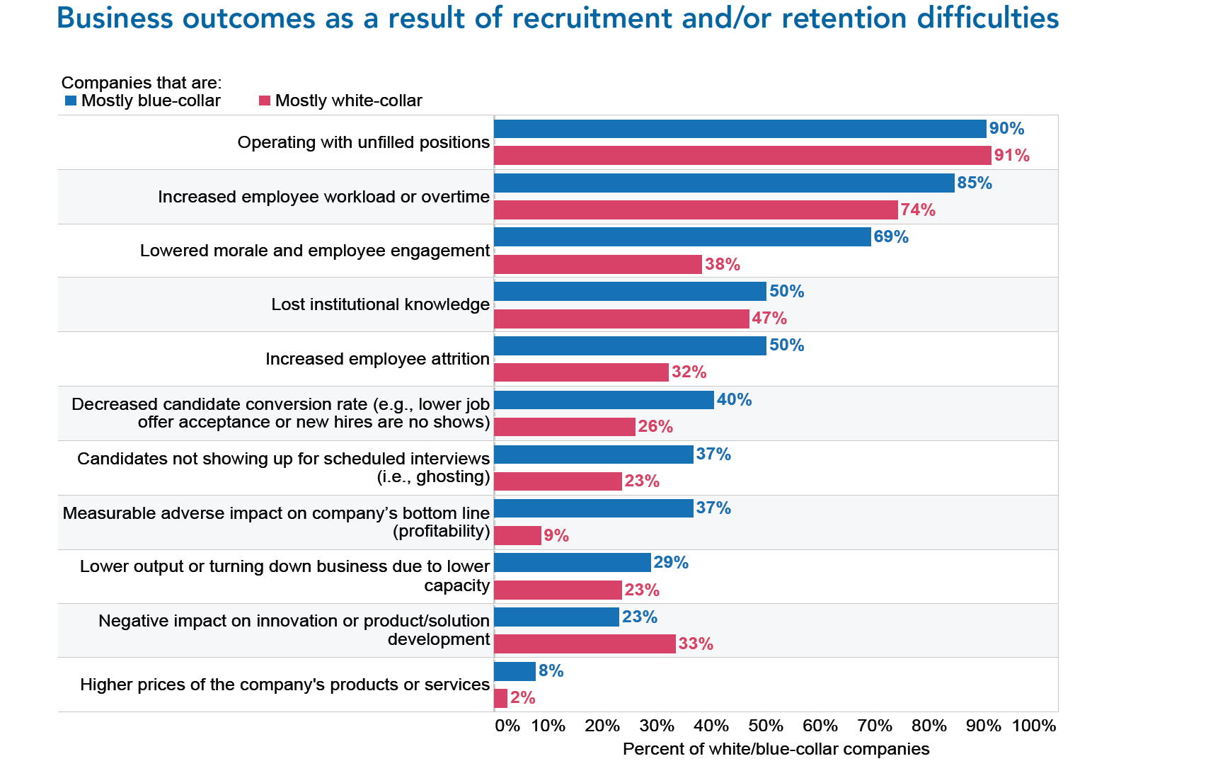
How is this affecting blue collar companies?
So we know the labor market it tough, but what impact is it having on businesses? And specifically, how is it impacting blue collar companies (like those in the janitorial industry). The graph below looks at various effects of the tight labor market, comparing blue collar to white collar firms. As a general rule, blue collar firms are more negatively impacted.
**Data and charts were taken from the EMSI “Demographic Drought” report and the Conference Board “US Labor Shortages” report.